
Sticker shock, part 2
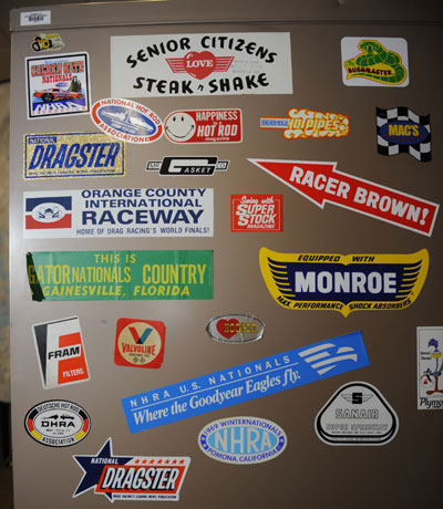 |
Welcome to Part 2 of the Sticker Shock thread that I began Tuesday. If you were sick that day or can’t muster the strength to scroll-wheel your way down this page, I'm showing off some of the vintage decals/stickers that I found on Photo Department filing cabinets that were uncovered during our recent move from upstairs in the 2220 E. Route 66 media tower. (OK, so it's only two floors.)
As expected, I've been besieged, bombarded, and blasted with e-mails from the Insider Nation showing their old decals -- and I'll share those in a future column, so keep sending them – as well as feedback on some I've shown. I'll also soon have a treasure trove of information to share concerning the Bold Attempt streamliner; I've heard from Mark Traylor, son of the car's original owner, Bill (now deceased), and from Top Fuel racer T.J. Zizzo, who was one of the car's later owners and competed with it in Top Alcohol Dragster with his father, Tony, driving.
The decals in this installment were the ones that, as I mentioned Tuesday, were not visible for years because that side of the (very heavy) concrete-lined fireproof filing cabinet was against a wall, keeping them from general view. And for some of them, I ran into a few walls trying to track down information, but, as always, the fans of this column knew where to point me, and, thankfully, I knew who to ask.
 |
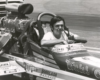 |
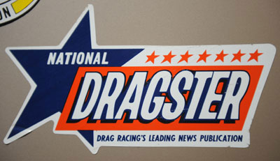
OK, so as you can imagine, these first two decals mean a lot to me because they represent my livelihood for nearly three decades. They aren't the first National DRAGSTER stickers made, but they're both pretty noteworthy. The top decal is perhaps still the best known of any ND decal, even years after its retirement. I remember seeing this decal stuck proudly on many of the sport's top cars in the 1970s, as shown on the windscreen of the Kuhl & Olson Top Fueler in the second image (more on that in a second).
What's important about this logo is the permanence of its basic design elements. I'm not sure why the color choice for this popular decal was orange and blue because the logo appeared in many, many color combinations throughout the years on the front page and covers of National DRAGSTER, but the seven stars have been an on-again, off-again prevalent theme through five decades.
The seven-star version first appeared on the publication in 1971 and stayed there until the end of 1983, when the logo was redrawn and the stars eliminated. In 1983, the word DRAGSTER had become standardized in yellow type on a rectangular field of blue, and DRAGSTER colors have remained blue and yellow ever since. The blue background square went away in 1985, allowing much more freedom and creativity for placement on the cover. At the insistence of Wally Parks, the seven stars went back onto the logo in 1997, and, after an appropriate mourning period following his death in 2007, they came off again last year.
You don't see a lot of publication (or website) decals on cars today probably because the real estate is more valuable, but I asked Olson about its 1970s omnipresence in general and its prominent placement on his Top Fueler specifically. His reply was brief but honest: "Those racers who chose to display the National DRAGSTER decal in a prominent location were at least perceived to be more likely to see photos of their cars in the publication. I'm sure that was never 'official' policy, but the perception was enough to strongly encourage the practice." Well, that explains it! Ha! Of course, it has never been our policy to discriminate that way, but maybe if it came down to two photos and one car was supporting us by flying our colors, I can’t say that it wouldn't influence me.
 |
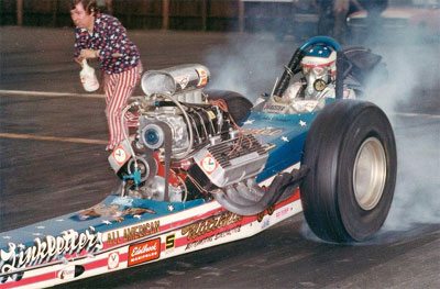 |
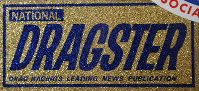
The curious metal-flake-background logo probably drove photographers nuts when they used their flashes, and I have to say that other than as a curiosity, the decal, which is circa 1969, isn't that great of a marketing tool from a visibility standpoint.
I dropped a line to former DRAGSTER Editor Bill Holland, who was at the helm of the good Ship ND from 1969 through 1974, meaning that this happened on his watch.
"We really had no control over the decals; they were pretty much a Sport Service deal as I recall," he said, referencing NHRA's early souvenir vendor, "most likely a collaboration between Wally, Barbara, and [Sport Service's] Chick Saffell. And while we may have 'cleaned up' the logo at one point, nothing was done to radically change things without Wally's input."
Holland also echoed Olson's assertion about the decal usage. "I actually don't recall any concentrated effort to distribute massive quantities of the blue/orange decal, but I guess there was kind of a thought among the racers that having one on your race car increased the odds of getting a photo of it in DRAGSTER," he opined.
Holland also sent a photo of the infamous (his word) Guedel & Holland/Art Linkletter's All-American Top Fueler, taken around 1969, sporting the metal-flake decal on the windshield. "Didn't help influence the editor, though (grin)," he noted. "Please excuse the questionable attire. I thought candy-stripe polyester bell-bottoms were cool at the time. And, yup, that's a genuine 'bleach bottle.' "
Holland also reported that when "Mousie" Marcellus restored his and "Wild Willie" Borsch's Winged Express fuel altered, the metal-flake decal was his choice.
 |
Speaking of logos near and dear to my heart, here's the old Orange County Int’l Raceway logo from the early 1980s. I don’t think there's a person alive who went to the County who doesn’t have fond memories (same can obviously be said for places like Lions, U.S. 30, and other ghost tracks, but OCIR was my home base for so many years). I did, however, always think it very curious that the track's logo featured an Indy car rather than a dragster because, despite the developer's plans and dreams of a multipurpose racing facility, only the dragstrip ever came to true fruition.
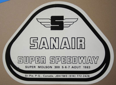 |
Here's the logo for another track that always brings back fond memories, Sanair, which hosted the NHRA Grandnational from 1971 through 1992. It remains NHRA's only national event hosted outside the borders of the United States and certainly proved an interesting venue. Sanair was near the tiny town (population about 5,000) of St. Pie, about 40 minutes north of Montreal in the French-speaking Canadian province of Quebec. Although there were plenty of English-speaking residents, all of the street signs were in French (arret = stop), and there was definitely the feeling of being in a foreign country. There were fruit stands alongside the track concessions, and fans – both male and female – wore some the briefest swimsuits I had ever seen.
Some racers hated going to the event (which only had eight-car fields) – there were plenty of horror tales of overzealous border guards having teams strip their trailers down to the bare walls before they could enter the country – but I always liked it. The venue, which also included the .826-mile paved triangular oval racetrack shown in the logo (the track hosted the Indy Montreal from 1984 to 1986), was the site of several nasty incidents, including Billy Meyer's severe fire in 1977, Shirley Muldowney's near-career-ending crash in 1984, and Don Prudhomme's 1990 blowover. The other interesting thing I remember about the track is owner/operator Jacques Guertin's home, which was at the end of the shutdown area. It was a tall, round tower, much like an aircraft fuselage standing on its nose. I never got to go into it, but there were stories that he guarded the residence with some sort of big cat (lion, cougar, or other) that lived in the tower.
 |
 |
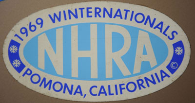
Here are a couple more NHRA national event logos like I showed you Tuesday, though it's clear that the format changed along the way. The top decal, from the 1969 Winternationals, is a welcome change from the previous year's logo (shown in the last column), which was pretty much the traditional red, white, and blue NHRA logo with the event name and venue top and bottom. Some real thought went into this version, with not only the icy blue colors but also the cute white snowflakes to the left and right of the NHRA logo.
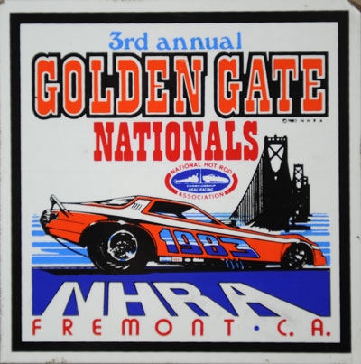
By the 1980s, the logos had changed to this square format, as evidenced by this colorful one from the 1983 Golden Gate Nationals, which features – ta-da! – an image of the Golden Gate Bridge. The great old Fremont, Calif., track – by then renamed Baylands Raceway Park – was about 40 miles inland from San Francisco but still seemed to benefit from the sea air. The track was famously good for performance, and the final national event staged there – the 1983 Golden Gates – gave it a ripping good send-off. In fact, it was so good that it was voted among the 40 Greatest Races when we had our 50th Anniversary voting in 2001.
Everyone seems to remember that Gary Beck ran 5.39 at the 1983 Finals at OCIR, but he did it first in Fremont. Beck, the first driver to run in the 5.6s, 5.5s, and 5.4s, smashed the 5.3-second barrier when he drove Larry Minor's Top Fueler to a 5.391, 252.10 blast in the Top Fuel final alongside the late Gary Ormsby, who lost with a 5.54 in what then was the quickest side-by-side race in the sport's history. The victory also helped Beck clinch his second and final NHRA Top Fuel championship. The Funny Car final between Meyer and Raymond Beadle was the quickest side-by-side Funny Car race of all time, with Meyer prevailing, 5.75 to 5.78. Similarly, the Pro Stock final was the quickest ever, with Frank Iaconio running 7.69 to beat Lee Shepherd's 7.68 on a holeshot. Vern Moats dominated the Top Alcohol Funny Car show with a pair of 6.36 runs – the first passes in the 6.3s – and broke the NHRA national record of 6.44. It was quite a race.
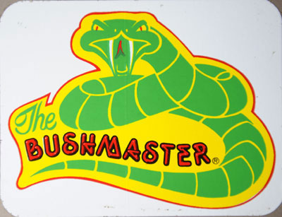 |
Longtime racer George Schreiber, who for years was a good friend of the DRAGSTER staff, made famous this logo for his "Bushmaster" nickname. He was one of the many characters I was introduced to in my first years here, even though his fuel racing days were behind him. Schreiber, like many racers, had an early fascination with cars, but it took a move from Montana to California to set him on his path. He found work with legendary ''Big Daddy'' Ed Roth, and together in 1963, they built the Yellow Fang dragster shown a few columns ago. According to Roth's website, he overheard Schreiber "talking about how streamlined dragsters were making better times, so Ed showed George a clay model of his concept. Thus Yellow Fang was born." Meticulous metalsmith Tom Hanna spent six months building the radical body, according to the site, which credits Steve Swaja with the design.
Schreiber ran a series of Top Fuel dragsters throughout the years before switching to jet dragsters in 1981. In a bio on the website for his Strafford, Mo., Rockin' Race Place restaurant/bar/museum ("where the pizza is always hot and the drinks are cold!"), he says that he got his nickname during the nickname heyday when there were so many tracks and racers that publications needed a gimmick. ''They didn't want to write 'Bill will race John,' they wanted to write 'the Zookeeper' will try to contain 'the Mongoose' and 'the Bushmaster,' '' he said.
 |
 |
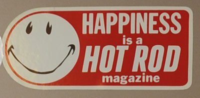
To Lucy and her fellow cartoon kiddies in the Charlie Brown universe, happiness was a warm puppy. To Johnny Carson, in his famous book, happiness was a dry martini. And to the Beatles, happiness was a warm gun. For the rest of us, happiness was a Hot Rod magazine, or maybe a Drag Racing USA magazine, or maybe a Popular Hot Rodding or a Car Craft; you've gotta dig this groovy 1970s-era sticker from the fine folks at Petersen Publishing, complete with the requisite happy face. There's no understating the important role that Hot Rod played in the hot rodding movement, with Wally Parks at the helm showing how the sport could organize itself and improve its image, how to set up car clubs and drag races, and, of course, find top dead center.
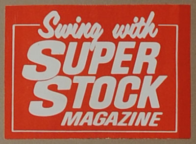
You could also choose to swing with Super Stock magazine with this sticker, which I have to presume is from the 1960s based on the choice of the word "swing." Now would be an appropriate place to bid farewell to John "Monk" Reynolds, the founder of Super Stock magazine, who passed away Jan. 10 after a long battle with cancer at age 73. Reynolds not only helped create (with Jim Davis) Super Stock but also Stock Car Racing magazine and was co-owner of famed York U.S. 30 Dragstrip in the late 1960s and early 1970s. Reynolds and Davis took advantage of the bustling doorslammer scene of the mid-1960s to turn their regional, seasonal newspaper into a full-on monthly magazine. Both Super Stock and DRUSA became part of the New York-based Lopez Publications empire, which made them a bit unique because the era's major monthly hitters – Hot Rod, Car Craft, and PHR – were based on the West Coast. Super Stock took full advantage of its Eastern base to cover the burgeoning Super Stock scene at places like Capitol Raceway and Aquasco and even staged for many years the popular Super Stock Nationals, a major East Coast match race (later incorporated into the Division 1 schedule). Our dear departed pal Stevie Collison took over the magazine and made it bigger and better in three tenures as its editor before we lost him at the end of 2000. And let's not forget, too, that Leslie Lovett worked for Super Stock in the late 1960s right before he came to NHRA, so I bet ol' LL still had a soft spot for the magazine.
 |
Though earlier this week I lauded Hooker Headers' heart logo as one of drag racing's most iconic, I've always thought that this decal, for camshaft manufacturer Racer Brown, was pretty special, too -- simplistic in design but very memorable nonetheless. The late W.G. "Racer" Brown actually was a magazine writer before taking his knowledge into the parts business. He was part of the Hot Rod editorial team in the early 1950s when Wally Parks was forming the NHRA and, according to NHRA historian Greg Sharp, ran a Porsche and a lakester at Bonneville and launched the camshaft business after he left Petersen. According to what I've gleaned from my research, although the company wasn't the largest in the business, his attention to detail, testing, and customer service were his hallmarks. "The Dragmaster guys ran his stuff with great success," Sharp pointed out. Brown also was the longtime companion of Shirley Bunce, who for years worked with us at NHRA as a travel coordinator and, most notably, in the contingency program. I understand the business still exists and is run by a former employee who purchased it.
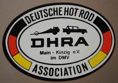 |
And finally, there's this interesting logo for the Deutsche Hot Rod Association. Anyone with even a rudimentary knowledge of foreign languages knows that means it's from Germany, but when I went online to research it, I couldn’t find a single reference to the association. Being the resourceful guy that I am, I turned to the aforementioned Olson, who for years led NHRA's international efforts and has visited the far corners of the world to help promote our sport (hmm … "corners of the world" is an interesting cliché unless you really do think the world is flat, no?). Anyway, here's Olson's reply. "DHRA was a hot rod and drag racing club in Germany. If my recollections are correct, it was established by a group of U.S. servicemen stationed there, some of whom are expatriates still living and working in Germany following their discharges from the military. A name that immediately comes to mind is Jerry Lackey, with whom I worked during my tenures at both SEMA and NHRA, as well as more recently with the FIA." Olson suggested that I contact Rico Anthes, who he said has been the primary promoter and organizer of German drag racing for the past couple of decades.
NHRA fans might remember Anthes for the Top Fuel dragster that he ran in the 1990s and before that a Mercedes-Benz-bodied Top Alcohol Funny Car that both occasionally were driven by Texas hot shoe Dal Denton, who also helped tune the fueler. I haven't heard back from him yet.
OK, that's it for my decals. In a week or so, I'll share some of your decals, and I’ll be back next week with other stuff that I've been hanging on to as well as that promised look at what became of the Bold Attempt. Have a good weekend.


